Here’s why the McDonald’s logo is upside
Feb 29, 2024, 1:04 PM | Updated: May 17, 2024, 3:51 pm
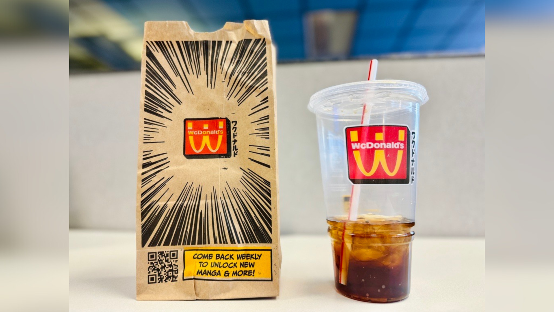
McDonald's new temporary logo is a nod to Japanese graphic novels (manga) as well as anime. (Caitlyn Johnson, KSL NewsRadio)
(Caitlyn Johnson, KSL NewsRadio)

SALT LAKE CITY — Your order from McDonald’s will look a bit different for a while. Look closely, and you’ll see the McDonald’s logo is flipped upside down. And the name has changed to WcDonald’s.
What’s up with that?
It’s a nod to Japanese graphic novels (manga) and anime. WcDonald’s will be around for about a month. Consumers will see the new versions of the McDonald’s logo on some of the restaurant’s packaging and on a new sauce.
Further, the company has created an official anime for Wcdonald’s. “Four episodic shorts will take fans into the flavourful world of WcDonald’s, where a story about the WcDonald’s Sauce and WcNuggets unfolds each week,” the company said in a press release.
Acky Bright and the new McDonald’s logo
A report by FastCompany points to manga artist Acky Bright as the creative force behind this temporary change. A webpage describes him as being “known for his detailed illustrations and bold brush strokes.” His artwork has been featured by “DC Comics and Hasbro, as well as BMW in Germany” the website also said.
Those familiar with Japanese graphic novels may already be familiar with the altered McDonald’s logo. It’s also appeared on anime television.
McDonald’s told FastCompany the marketing has a twofold goal: to honor another culture and to keep (or get) the popular fast-food chain in the minds of new, young, consumers.
Keep reading: Many Americans choosing fast food over grocery shopping